Yes, your print colours are different from screen colours, and it is normal rather than a fault. How close the result gets depends on your artwork files, the material you print on and whether you approve a physical proof first.
If you wondering why Are print colours different from screen colours, we prepared this guide for you. The main reason is that screens produce light, while printed materials reflect it. This difference can make a vibrant logo or image appear softer or darker once printed, even when the artwork is correct.
At Manchester Signs Centre, we help businesses understand how artwork, print settings and material finishes affect the final appearance of their signage. Whether you choose ACM, acrylic, Foamex or Correx, knowing these differences can help you achieve better print quality.
This guide explains five common reasons why colours change between screen and print, along with practical ways to get more consistent results. Let us show you how to set realistic expectations for ACM, acrylic, Foamex and Correx signage.
Quick Overview: Why Print Colours Different from Screen Colours
|
Reason |
What happens |
How to reduce the gap |
|---|---|---|
|
Light vs ink |
Screens emit light, print reflects it |
Judge colour from a physical proof |
|
RGB vs CMYK |
Bright RGB colours fall outside the printable range |
Supply CMYK artwork or Pantone references |
|
Material and finish |
Gloss, matt and substrate tone change the result |
Proof on the actual board |
|
Screen settings |
Brightness and calibration vary between devices |
Use soft proofing, then confirm in print |
|
Printing method |
Each process has its own colour range |
Agree the method and run a test print |
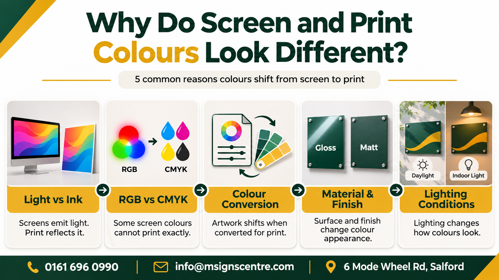
1. Why Do Screens Emit Light While Print Only Reflects It?
Your monitor is a light source. Printed materials are not, so they can only reflect whatever light falls on them.
A screen builds colour from red, green and blue light, and it starts from black. A printed sign starts from a white or coloured surface and uses ink to absorb some wavelengths and bounce others back.
-
Screen display: glowing, backlit and affected by blue light from the panel.
-
Printed sign: lit by daylight, shop lighting or street lamps, so it changes through the day.
Screen brightness also affects how we judge certain colours. For example, a highly saturated image may look vibrant on a bright monitor but appear more muted on a printed board. The difference becomes more noticeable when the sign is viewed in a darker environment, making colours appear less intense than they did during the design stage.
That is why a vivid colour on a laptop can look softer on a Foamex board in a Deansgate shop window.
2. Why Does RGB vs CMYK for Signage Change Your Colours?
This is the biggest cause. RGB colours cover a wider range than CMYK inks can reproduce, so some bright shades simply cannot be printed exactly.
RGB stands for red, green and blue, while CMYK uses cyan, magenta, yellow and black. A standard 8-bit RGB image can represent up to 16,777,216 colour combinations, although not all the colours visible on a screen can be reproduced by standard printing inks.
For digital use, designers often work with RGB colour spaces such as sRGB or Adobe RGB for colour management. Adobe RGB covers a wider range of certain colours, particularly greens and cyans, making it useful for editing vibrant images. However, a wider colour space does not guarantee that the same saturated shades will appear in the final printed output.
The colours most affected are:
-
Electric blues and bright cyan
-
Vivid greens
-
Hot pinks, magenta and neon-style oranges
Reds and yellows usually hold up better. A flat navy or a deep red will normally sit much closer to your screen version than a bright RGB green.
3. How Does Colour Conversion Affect Your Artwork Files?
If you send an RGB file, it must go through colour conversion before printing. The software picks the closest printable match, which can shift saturation and tone.
To prepare artwork properly:
-
Supply a CMYK version of your logo alongside your RGB file.
-
Include Pantone references for any brand colour that matters.
-
Avoid pure RGB black, which can convert to a dull dark grey.
-
Send vector artwork files where possible, so edges and colour fills stay clean.
Colour management settings and rendering intent also affect how out-of-range colours are squeezed into the printable range. Your printer handles this, but it helps to know it is happening.
How Do Colour Profiles Improve Print Accuracy?
Colour profiles help control how an image appears across different devices and printing systems. An ICC colour profile tells software how colours should be interpreted and converted for a particular screen, printer or output material.
Using the correct profile helps reduce unwanted colour differences and improves consistency between artwork and printed products. Professional printing workflows also follow recognised industry standards to manage colour accuracy.
However, the final result still depends on the printing method, ink and material. Even a properly managed image may look slightly different when printed on a rigid board rather than paper.
4. Can Pantone Colours and Materials Guarantee a Brand Colour Match?
Pantone colours provide a recognised reference for maintaining brand consistency. In traditional spot-colour printing, Pantone inks are pre-mixed to specific formulations, helping printers achieve more consistent results on a printing press.
However, many digitally printed signs use process inks to reproduce Pantone shades rather than applying the original pre-mixed ink. As a result, some colours cannot be matched exactly, particularly highly vibrant greens, oranges and other saturated shades.
Providing your Pantone reference helps communicate the intended colour, but the material, printing method and finish will still influence the final appearance.
The material matters too:
-
ACM (Dibond-type) panels: smooth, white surface that gives crisp, consistent colour.
-
Acrylic: colour can look deeper, especially if printed on the reverse. See our guide to acrylic business signs for offices, shops and clinics.
-
Foamex: light and cost effective, with a matt finish that softens strong colours slightly.
-
Correx: a fluted board for short-term use, where the ridges can show through on solid colour.
At Manchester Signs Centre, our team designs, manufactures and installs signs in-house at our Salford workshop, so we can advise on how your brand colour will behave on each board before anything goes to print.
5. Do Screen Settings, Printing Method and Lighting Also Shift Colour?
Yes. Even before print, no two computer screens show colour the same way. Brightness, contrast, night-mode settings and calibration all vary slightly between devices.
Soft proofing helps by simulating print colours on your monitor, but it is still an approximation. Treat it as a guide and confirm with a physical proof.
The printing method changes things further. Each process has its own colour range and ink set, so results can vary slightly between methods. Our UV printed signs page explains how direct printing onto rigid boards behaves.
Lighting also plays a part. A sign under warm LED lighting in a Market Street unit will read differently to the same sign in cool daylight.

How Can You Get Closer Colour Matching on Your Signs?
You cannot make print identical to a backlit screen, but you can get a predictable result. Follow these steps:
-
Supply CMYK artwork files and your Pantone references.
-
Tell the printer the material and finish you want.
-
Ask for a test print or physical proof on the real substrate.
-
View the proof in the lighting where the sign will hang.
-
Approve in writing, and quote the same reference on repeat orders.
Does Paper Choice Affect Printed Colours?
Yes. Paper choice can make a noticeable difference to the colour and quality of printed images. Different paper types have different surface coatings, textures and levels of ink absorption, which affect how light reflects from the finished print.
-
Matte paper: Diffuses reflected light and often gives colours a softer, less saturated appearance.
-
Glossy paper: Usually produces richer, more vibrant colours because its smooth surface enhances contrast and colour saturation.
-
Uncoated paper: Absorbs more ink into its fibres, which can make certain colours appear duller than on coated stock.
Some paper types also contain optical brightening agents, which react to ultraviolet (UV) light and can change how white areas and printed colours appear under different lighting conditions.
These principles also help explain why print finishes matter for signage. Although ACM, acrylic, Foamex and Correx are not paper materials, their surface properties can still influence the final printed colour. A paper proof should therefore not be treated as an exact representation of a finished sign.
At Manchester Signs Centre, we offer free design and free site visits, so we can talk through colour choices with you before production starts. For longer runs, our print signs service is a good starting point, and banner printing follows the same colour rules on PVC and mesh.
Getting Your Printed Signs Right With Manchester Signs Centre
If colour accuracy matters to your brand, these services give you the most control.
-
Outdoor Signs: weatherproof printed boards where we can discuss material, finish and how daylight will change the colour of your brand.
-
Window Graphics: printed and frosted graphics, where colour looks different with light behind it, so a sample check is especially useful.
-
Shop Front & Fascia Signs: high-visibility signs where brand colour consistency matters most, supported by free design and site visits.
FAQ
Why do my print colours look different from my screen?
Screens create colour with light, while print uses ink that reflects light. Ink cannot match the brightness of a backlit display, so some shades look duller.
Should I design signage artwork in RGB or CMYK?
Use CMYK for anything that will be printed. It keeps your colours inside the printable range and avoids surprises during conversion.
Can you match my exact brand colour?
Often very closely, but not always exactly. Give us your Pantone or CMYK values and we can advise on how it will look on your chosen material.
Is a physical proof worth asking for?
Yes. A physical proof on the real board is the only reliable way to judge colour, finish and contrast before the full job is produced.
Will the same colour look the same on ACM, acrylic and Foamex?
No. Surface tone, gloss and ink absorption differ between materials, so the same file can look slightly different on each.
Why does my printed sign look different at different times of day?
Printed colour reflects ambient light, so daylight, shop lighting and street lamps all change how it appears.
Order Printed Signs With Colours You Can Trust
Your business signs should reflect your branding as closely as the material and printing process allow. At Manchester Signs Centre, we can help you choose suitable materials, finishes and artwork specifications for your signage.
Our Shop Front & Fascia Signs keep your brand colour consistent in the place customers see it first, while our outdoor signs let us check material and finish against your artwork before production.
We offer free design, free site visits and no-obligation quotes, with installation across the UK. Speak to the Manchester Signs Centre team today to discuss your requirements via our contact page.